My project from last fall, in conjunction with planning for some upcoming exhibitions, is making me think more about abstraction and representation: if these terms are useful and where they are relevant. Complicated words, they each have multiple layers and definitions that vary by context.
Chloë Bass has considered abstraction, wondering if it is a privilege, but concluding instead that it is essential for bringing people together. This approach is relevant, not only to my exhibition of Dan Ramirez’ work, but it speaks to many other recent exhibitions that focus on or unearth or explore the work of artists of color working in abstract, minimalist, or non-representational visual styles. How are these approaches interpreted by museums?
That is, of course, if there is actually any work by artists of color in the museum to be interpreted. It seems that some museums have finally caught on to the imbalance of their collections. But what will they do with the work once it has been purchased and accessioned? Will it go into storage with the other 92-98% of the collection? Will it stay there for 20 years without being researched or interpreted?
(When I say “interpret,” I mean display. When a museum displays a work of art it is interpreted: selected, installed with other works within a larger scheme or organizational structure, lit and labeled, accessible during open hours, for an admission fee or not, under electronic or human surveillance, climate controlled, documented, stanchioned, managed by museum etiquette like do not touch or no flash photography please, hash-tagged, pictured on posters and greeting cards in the shop, nicknamed, examined, and seen by hopefully very many people. Adding text in the form of a label or a docent tour or a curator talk or an audio file or a web exhibition is an additional layer of interpretation. The museum identifies the work with artist, title, date, medium, and credit line, which is interpretation. If you don’t agree, have you ever asked an artist about the date when a work was completed, the title of a work, or whether they used graphite or pencil? The answers that make it onto the label are interpretation).
Rashid Johnson has talked about how representation of the Black body has offered a way into museum spaces for Black artists. (I would say this goes for Latinx artists too. Figurative work by artists of color is easier for white curators because it is clearly identifiable as culturally-specific. Maybe images of cholos, madonnas, or sharecroppers are easier for marketing teams, too?) But what about artists who do not work in representational modes? If Sam Gilliam’s detachment of canvas from stretcher can be understood within a history of protest–in Johnson’s words, as “emancipation”–is this dichotomy, representational and abstract, useful at all?
Such limited terms obscure similarities and suggests a non-existent conflict. For example, when artists are interested in perception, in creating work that unsettles our understanding of what we see, is there only one path available? Is it either, or? Of course not. Both Dan Ramirez and Faisal Abdu’Allah make art work that questions how we make sense of what we see, and their work and practices could not be more different.
Ramirez’s approach is unapologetic. He is not interested in discussing his latinidad, damn it, he is applying paint to canvas or graphite to wood, and thinking about our ability to understand the world. He plays perceptual games using geometry and light, surface and depth. The play is deeply connected to philosophical pursuits, along with his considerations of belief and doubt. His work makes you question what you see.
Abdu-Allah’s approach is figurative and community-based; he uses photography, printmaking, weaving, and other media to represent gatherings of people. FauHaus and Visage were collaborative projects, developed in partnership with groups of students. But his objects also refer to groups of people: a gold barber’s chair standing in for the important sociality of the barber shop.
His two Last Supper tapestries picture groups of people also, but what is represented is not easily read. The iconography has been mixed up—the typical Eurocentric Christian Last Supper is transformed here with women and Muslims, or contemporary dress and a display of weapons. Not only is the imagery changed, but the medium has undergone an alchemical transformation from photograph to Jacquard tapestry, playing again with the Eurocentrism of the title. These works make you question what you see.
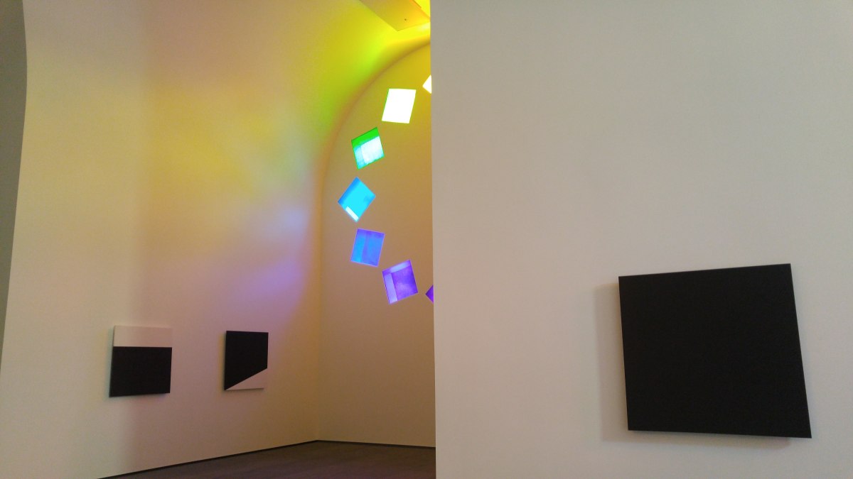
If the display of Ramirez’ Aletheia: Scribe’s Reveal was a dramatic statement about the artist’s career and aesthetic vision, Duppy Conquerer is Faisal’s own coming out. Using imagery that is forthright and insistent, this is a loud and clear assertion of himself as an independent artist within an international art world. With a nod to his Jamaican heritage and an I-don’t-have-time-for-your-shit stance, in black clothing and mask, he is a story-teller and magician, mentor and scholar. He represents. And yet, with photograph transformed into tapestry, individual into icon, the work makes you question what you see.
Perception is a tricky thing. Michelle M. Wright calls this interaction between work and viewer the “physics of Blackness”:
In any given moment, when the spectator engages a work of art, different valences of Blackness may formulate, expand, or multiply, qualitatively and quantitatively. What is Black art? That may very well depend on the time and the space of the moment.
So, how do museums interpret the work of Black or Latinx artists? Representation and abstraction are complex terms that indicate what happens when the viewer is engaged. What is it that you think you see? That’s the question.